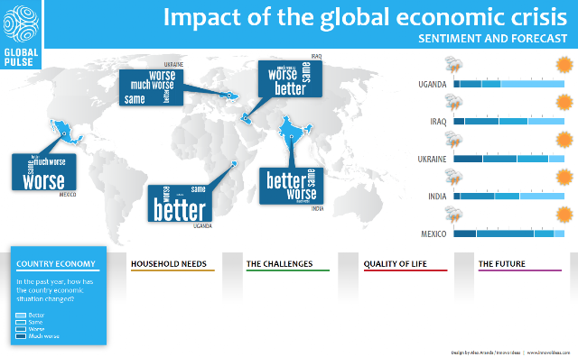
Not long ago I designed a visualization using data from the UN Global Pulse Mobile Survey. This visualization represents the Impact of the global economic crisis in 5 countries and its population Sentiment and Forecast.
Although we were dealing with different data types, the objective was to clearly represent –at a first glance– the sentiment and forecast for each country based on 5 questions related to:
- Country Economy
- Household Needs
- The Challenges
- Quality of Life
- The Future
For question 1 and 2 the gauges were divided in 4 sections based on predefined answers.
For questions 3, 4 and 5 the gauges illustrate a positive/negative sentiment based on the answers . Due to the variety in the answers, a common denominator was found in the sentiment, rather than in specific answers.
In addition, each question uses a tag cloud (weighted list) where we can clearly identify the most popular sentiment in each of the countries involved in the survey.
View the complete visualization here.

